“Columns” are part of the row and they hold your content elements inside them. It can be reordered. Click and drag column around horizontal axis. That way you can group elements in logical groups and then drag them around with your mouse to re-position. By considering this article, you can easily manage content in a column.
Column setting includes three major customization options namely General, Style, Overlay. To know more about these in details, read on article to the end.
Overview
General
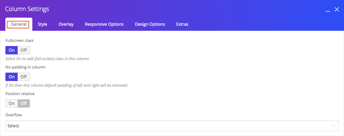
| Fullscreen class | Click “On” to add full-screen class content in a particular column. |
| No padding in column | If On then this column default padding of left and right will be removed. |
| Position relative | All content belongs to this column and content should not display outside this column. |
| Overflow | This option specifies what should happen if content overflows a column. This property specifies whether to add scrollbars when a column content is too big to fit in a specified area. |
| Z-index | The z-index property specifies the stack order of a column content. An element with greater stack order is always in front of an element with a lower stack order. |
| Clear both for desktop | The clear property specifies on which sides of an element floating elements are not allowed to float. None: Allows floating elements on both sides. Both: No floating elements allowed on either the left or the right side. Clear both for mini desktop: Same description as per clear both for desktop but this applied for mini desktop Clear both for tablet: Same description as per clear both for desktop but this applied for mini tablet Clear both for mobile: Same description as per clear both for desktop but this applied for mini-mobile |
| CSS animation | Select type of animation for columns to be animated when it “enters” the browsers viewport. |
| Animation delay | The Animation delay specifies a delay for the start of an animation. The animation-delay value is defined in milliseconds (ms), like 200. |
| Animation duration | The Animation duration defines how long an animation should take to complete one cycle. The animation-delay value is defined in milliseconds (ms), like 200. |
Style
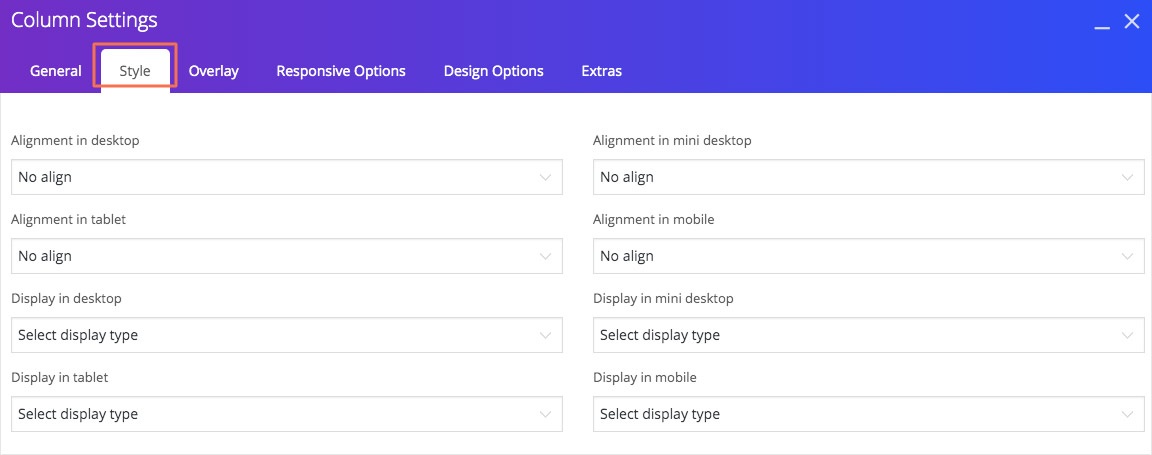
If you want to make changes in column styles, refer below information. With this details you can customize column inside particular row as per your desire.
| Alignment in desktop | To alignment the text inside column for desktop. |
| Alignment in mini desktop | To alignment the text inside column for mini desktop. |
| Alignment in tablet | To alignment the text inside column for tablet. |
| Alignment in mobile | To alignment the text inside column for mobile. |
| Display in desktop | This setting specifies the display behaviour of column for desktop. |
| Display in mini desktop | This setting specifies the display behaviour of column for mini desktop. |
| Display in tablet | This setting specifies the display behaviour of column for tablet. |
| Display in mobile | This setting specifies the display behaviour of column for mobile. |
Overlay
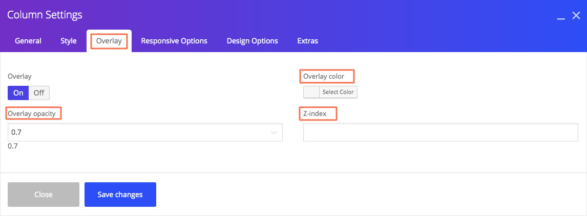
If you want to add overlay in column, click “on” button. When you select On then below settings will appear in the column setting tab.
| Overlay color | This is for to choose overlay color. |
| Overlay opacity | The Overlay opacity property sets the opacity level for an element. |
| Z-index | The z-index property specifies the stack order of an overlay. An element with greater stack order is always in front of an element with a lower stack order. |
Responsive Options
Use this options to set by default width for column in different devices. You can also adjust column for different screen sizes and you can control width, offset, and visibility settings for desktop, mobile, iPad, laptop, and tablet.
